Linda’s Living Room Reveal shows you how to brighten up your space without having to replace all of the furniture.
I’m so excited to share my SIL, Linda’s living room reveal with you today! I’ve had these pictures sitting in my computer to post since this past Spring but as the story goes, life happens. I have more content than time allows so this means posts get pushed back. Well, I figure now is better than never right? If you’ve been following along, you know I decorated my SIL’s new house this past Spring. She literally moved into the home adjacent to ours in the culdesac. We both have an open door policy with our families and it’s been nice having them so close to us. We share meals, swap babysitting and I get to watch my nephews grow up alongside my kids.
The first project I completed for Linda was for her large foyer area. They are still very happy with this area in the home and I’m so glad how quickly it came together.
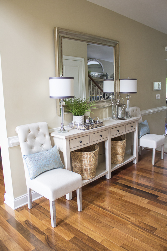

Right after I finished the main entrance, I helped her with her living room. The main living/family room is open to the kitchen and breakfast area.
As with any good room reveal, we need a BEFORE.
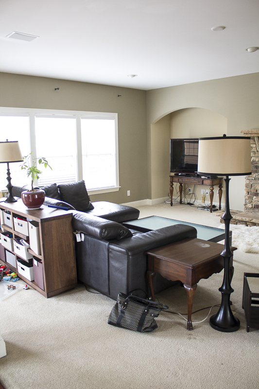
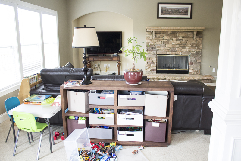
Linda wanted to soften the room without having to paint the walls or change out the dark leather sectional. Another important factor was to stay under a certain budget. Maybe you’re in a similar situation where you can’t paint the walls or buy everything new but you are wanting a change.
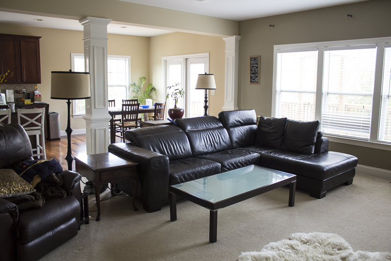
The open floor plan is great because it has an airy feel to the space but all the dark colors were making the room feel drab and too masculine for her taste. This area gets terrific lighting so we had that going for us. The challenge was overcoming the dark couches, furniture, lamps and wall color.
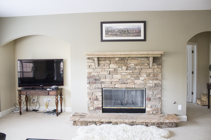 I’m not a fan of nooks especially when they are placed right next to the mantle! It creates a design conundrum because two spaces compete for the main focal point in the room. Does that console table look familiar? Well, that’s because I painted it and brought it into my guest room to use as a desk for the one room challenge! #allmine The table was temporarily holding the tv but it looked super awkward there with it’s big head and small legs. Ha!
Now for the AFTER!!! My favorite part!!
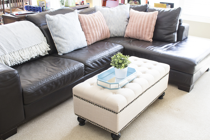
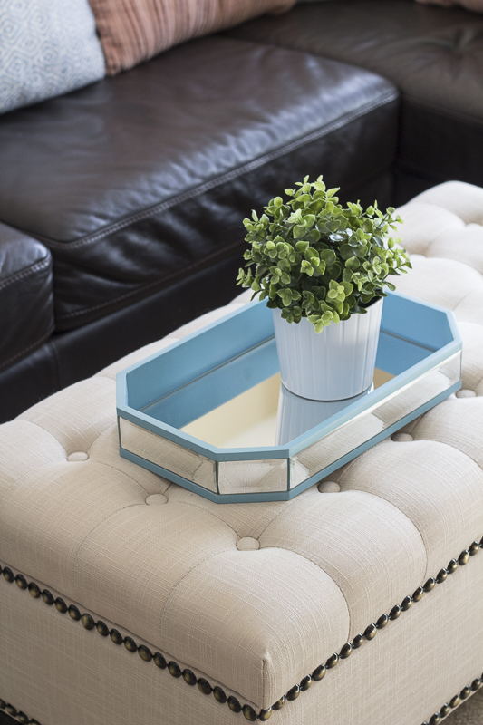
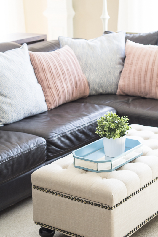
One of the best tips to soften and lighten a room without having to change the larger pieces of furniture is by adding throws and pillows. We went with some soft pinks and cooler shades of blue to add a freshness to the room. The tufted ottoman replaced the other dark modern coffee table. It also serves as storage for games and blankets. A blue wooden and glass tray adds a touch of glam to the new coffee table but also serves as a place to hold drinks and remotes.
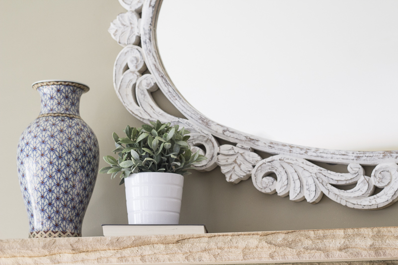
The mantle was also a bit tricky because it’s so high. I must’ve changed out the decor piece five times before finding this beautiful white washed detailed mirror. I kid you not, two women stared me down to see if I would change my mind and put it back at the store. Not today, ladies! Not today! I took that Anthro-esque mirror to the front of Homegoods and made sure it came home with me that day. It adds a soft, feminine touch to the room and the white helps to brighten the space.

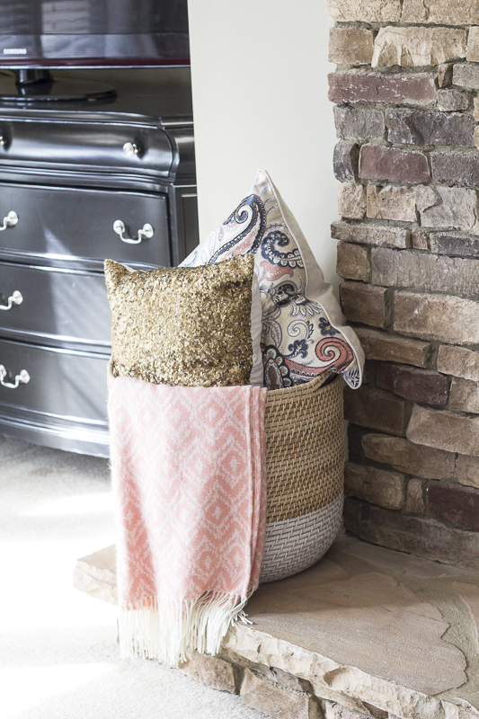
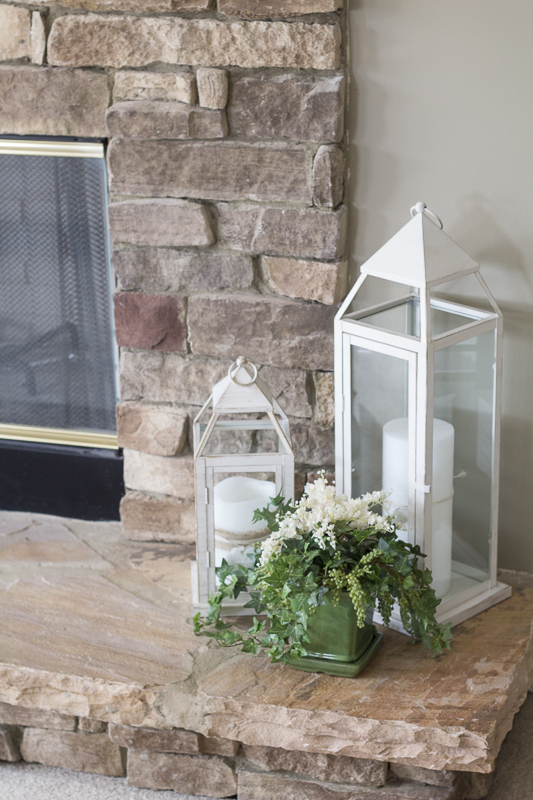
I added some faux greenery and added lanterns to the bottom. A pretty basket holds extra pillows and a throw blanket. It’s practical but still adds a beautiful touch to the space. Linda likes to keep things minimal so I made sure to keep it that way.

Remember that weird large nook?
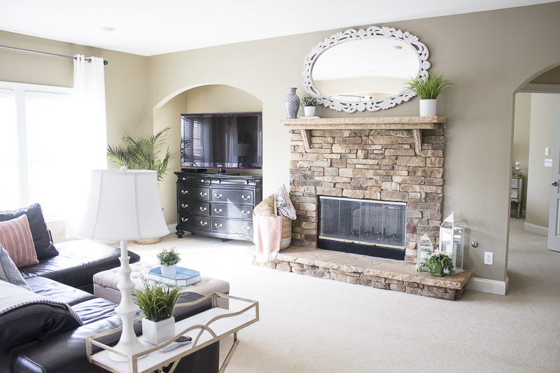
We moved Linda’s bedroom dresser into this space and it fit perfectly. Since her closet is rather large, she wasn’t utilizing this dresser as much. I measured and realized it would fit perfectly into the nook. Think outside the box when it comes to furniture. A dresser doesn’t always have to live in a bedroom. I use one in my office to hold crafts, office supplies and my printer. The one here functions as a media center and can hold all of the media equipment along with games and such. The TV blends in with the dresser and doesn’t stick out like a sore thumb since the color is consistent. The best part? Linda saved money from having to buy a media stand for that odd space.

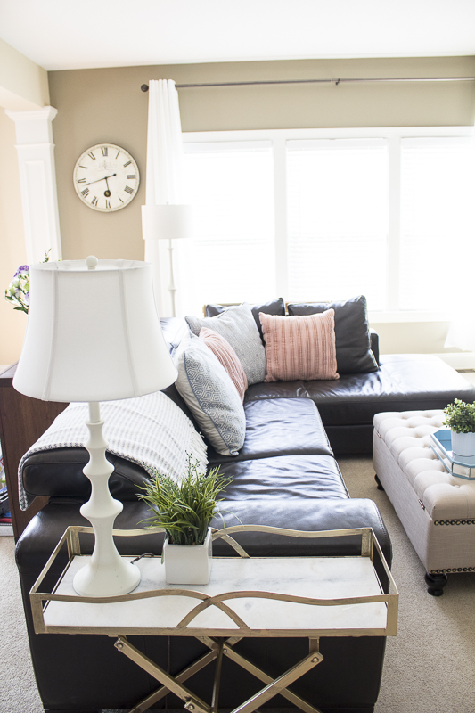
Instead of a standard side table, I saw this gorgeous inexpensive bar cart side table from Homegoods and thought it would be perfect next to the sofa. Since it had to be narrow and a certain size, it fit right alongside the sofa. Linda wasn’t so sure about it when I told her on the phone but she loved it once I put it there. It also has wheels so it can easily be moved and utilized as an entertaining piece for guests. The marble on top adds a chic and classy statement. Since the room doesn’t have an overhead light fixture, lamps are necessary for the evenings.
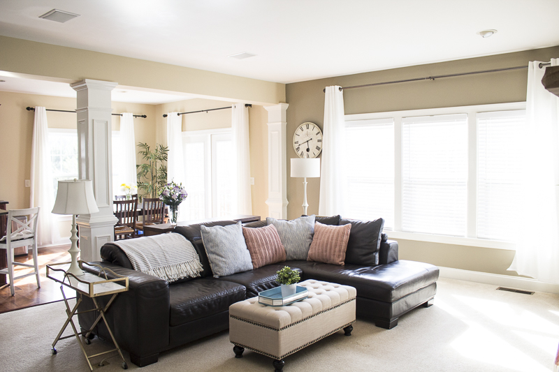
If you look closely, I chalk painted over both of the black lamps white and changed out the shades. This was an inexpensive change but again, helped to lighten up the space. We also had white curtains installed in both the family room and breakfast area. Always hang curtains higher and wider out to make your windows appear larger.

Always add fresh plants whenever possible. They bring life, color and helps purify the air.

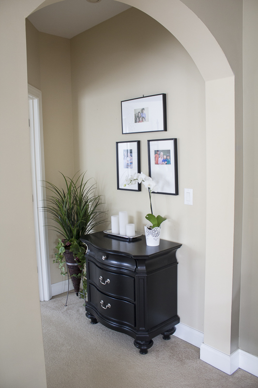
There’s a small landing area in between the family room and master bedroom. We moved the nightstand that actually matches the dresser into this area and I placed more black and white frames above it with some family photos.

I spy two little ones in the corner 😀

I created additional seating space in the living area with some chairs that Linda fell in love with.
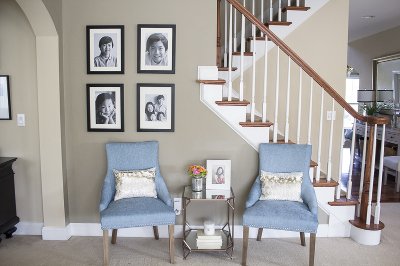 Emmy seems to think this is more appropriate area for snacks.
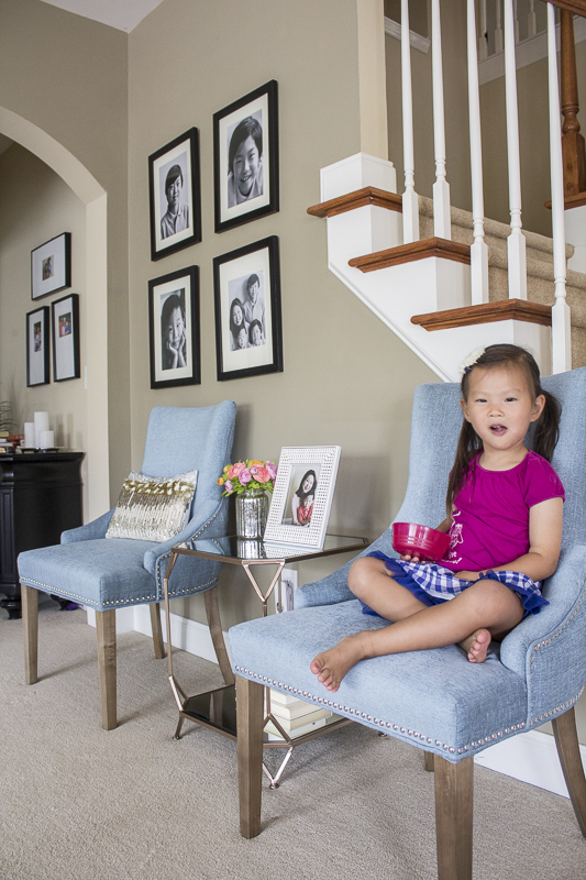

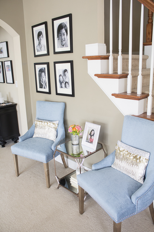
I took some black and white shots of the kids and wanted to add them in some frames that she already had. Adding black in a room always helps to ground the space and enhances the other colors in the room.
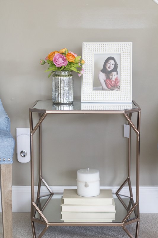
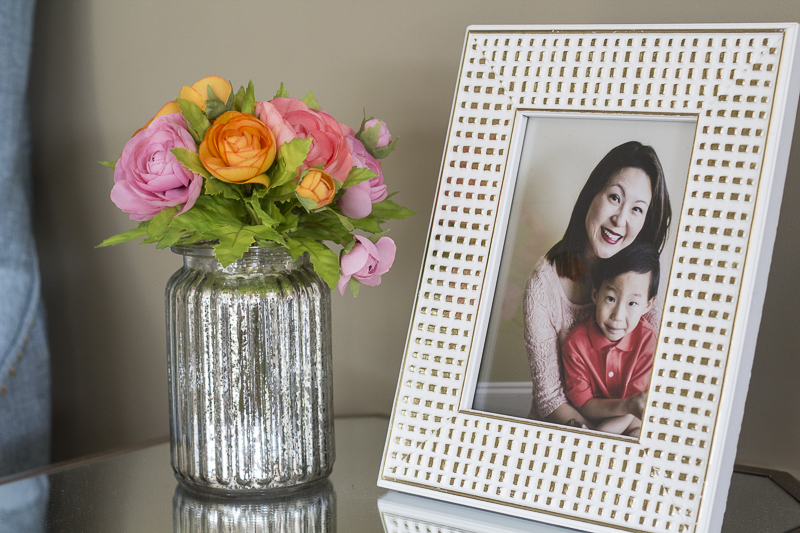
Isn’t that photo adorable? Let’s look at the before and after for the last time.
BEFORE

AFTER


Here’s a source post on Linda’s foyer and living room makeover. Be sure to check it out for details on where you can find similar items for these two rooms.
Hope you’re having a wonderful, virus free Monday! 😀
Yuni
PS: This living room makeover was included in an awesome roundup over at Shutterfly’s 100 Original Living Room Ideas! Go check it out and see what other inspiring spaces they’ve collected.
Let all that you do be done in love. 1 Corinthians 16:14
You are freaking awesome, my friend. 🙂
Aww thanks, Esther! 😀
The space is gorgeous! Love the colours ♥
summerdaisycottage.blogspot.com
Thank you so much, Summer!! I appreciate you stopping by!
Love the furniture, especially love the decorative touches. Beautiful!
Thanks, Adrienne! Glad you loved it!!
Lovely! I have a similar situation in my living room – feels too dark, with large leather couches. This definitely inspires me to get moving on fixing it. I love how you used light pieces throughout the room (pillows, that awesome mirror, etc.) to brighten it up, and especially love the white curtains. =-) Have a wonderful Wednesday!
Thank you so much, Alison! I’m so glad these ideas are helping you with your current space. It’s amazing how much a room can brighten up with the use of different fabrics, plants and other pieces of decor. Thanks so much for commenting!
The space and decor is gorgeous!! Gave me a lot of inspiration to lighten my own family room!! Thank you 😍
Hi Chevonne! I’m so glad to hear that! Thank you so much for the sweet comment and for reading. Glad you got inspired 🙂 Good luck!!